Palette Knife again

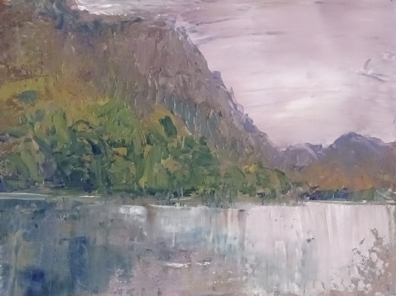
I think this is a bit of a disaster compositionally speaking. It is two pictures,  neither of any great merit.  I did cope more successfully with the right hand promontory  but the flare of orange at the edge of the painting, the two dimensional mountains, and the jumble supplying the trees ….


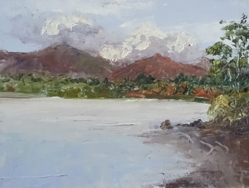
This is the same view, but a better composition, and a better painting.  The clouds are a bit clunky, but the overall feeling is of a day full of sunshine and showers.  The colours in the distant trees is nearer to Autumn, and the light reflecting off the water is one aspect of the Lake District everyone loves.  I’ve made a bit more of the headland, and lapping water, as I’m beginning to understand what the knife can do in these circumstances.  Palette knives made good mountains once you get the hang of it.

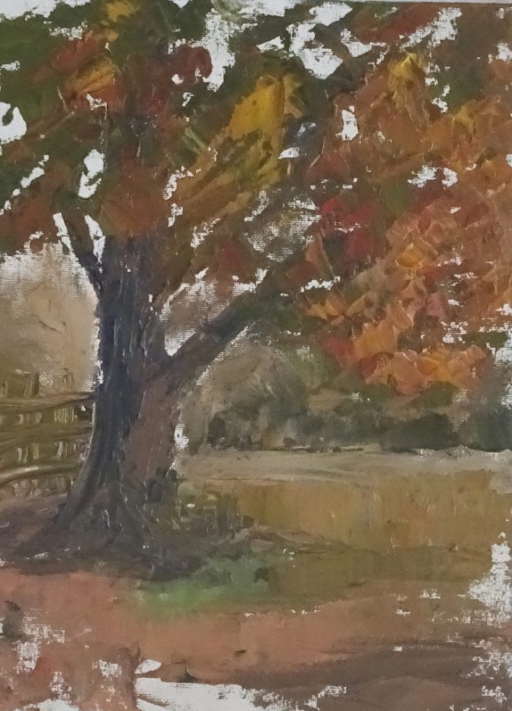
Finally, as a break from wrestling with wind and water, I turned round and did a tree!

Monte Bianchi 02

First I needed to deal with the distant hillside.  The pastels I used are too bright though in a good part of the spectrum.   They are a pale blue green, so I chose a pale peach pastel from the other side of the colour wheel, and gently overlaid it, disturbing the underlayer a little so that the two blended.   Now we have a greeny blue hillside that is much reduced in intensity.

The tree in the foreground is an important part of the composition.  Unusually, the leaf shapes are quite distinct.  If you measure one of them against the width of the door, you will appreciate their size too.  Treating them all as “mass” would work, but it is an opportunity to try another way of showing trees.

I selected five greens of the same “family” and added a bright yellow.  My aim was to create some of the leaf shapes on the edge of the tree using differing pressures on the pastel to create the shapes I saw.  There is no need to follow the photo slavishly.  A joyous approximation will suffice.  Where the leaves mass, I have used more solid strokes and scribbles, but broken the edges with more definite shapes.

Looking at the photo of the painting, I notice I have a square tree behind my star performer!  That’s for next time.

Keswick paintings

Recently, I visited Keswick on an oil painting course, using a palette knife only, en plein air.  October can be beautiful, a sort of Indian Summer, but this October wasn’t so.  In fact it was very cold and somewhat rainy.  This was a transferred holiday from April this year (which was balmy) – a very strange year.

Behold my first effort.  Bearing in mind that my clothing (inexperience shows) wasn’t adequate, and that rain passed by intermittently, and the thin wind blew straight at us across the lake,  I didn’t do too badly.  It’s not what was in front of me,  and the tonal variation of the trees is poor, but it looks like a rainy mountain.

The new thing was doing landscape using a palette knife only.  I have painted townscapes in the studio using a palette knife, and one landscape impression used as a background for flowers, always with a brush handy for final details if necessary.  Manipulating the knife to say what I wanted involved some contortions at first.  For instance, this view was relatively friendly to a left-hander, not a problem I had to address using a brush.   The descending hillside met the lake where a left-hander could create the acute angle  comfortably.  Increasingly during the course there were “right-handed” views.

The other interesting “thing” was mixing the right colour and, more important, the right tone, proved surprisingly difficult.  This was partly because the chasing clouds changed the tone by the minute, and partly because the general light outside is different.  Mixes I confidently used in the studio, were near-misses in the open air.

Pastel – Monte Bianchi

It was so good to see all my friends at the Zoom demonstration.  I do miss our weekly meetings in Holt – maybe next year?

This week I was working with a vertical board, standing somewhat constrained by the camera at my right elbow.

Now I can stand back and assess the result of this stage in the painting, I can see, as can you, from the juxtaposition of the photo and the painting that the tonal values are in the right place so that the picture can be “read”.

The distant mountain is too close, the colour too bright, too glowing.

I like the purple shadows, though they need to be modified, perhaps towards to blue end of purple, and it needs something warmer still in the lighter areas of the building.  I’m not aiming to match the photo, but to recreate the feeling of the place, mid-morning on a very hot day in a very quiet place on one side of a deep valley.

The strength of the building is there already, and the gentle slope of the hill before it takes a nosedive just over the fence is suggesting the charm of the place.