Tulip time

Just to remind us that Spring is on its way.

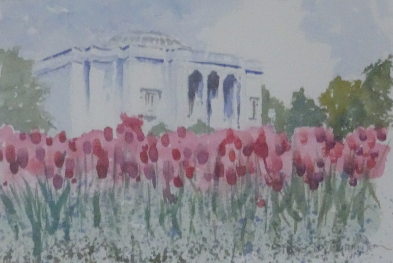
A rather free interpretation of tulips in Pot Sunlight – the Lady Lever Gallery overlooks the garden leading to the rather splendid War Memorial.

The building itself is sketched in using shadows create its shape.  It always surprised me how much of a likeness you can get just by painting a few shadows!  Anything more detailed would overpower the flowers,  the focus of the picture.  Using blue helps to push the building back, as does the largely blue green of the trees.

The flowers themselves were indicated by a mid-toned pink wash across the page which was allowed to dry.  Then I introduced  solid shapes made  in dark tones of Alizarin Crimson, some of them touch with blue, by pressing on the heel of the brush for each individual flower head.  Bluey green leaves and stems, randomly connected to flower heads provide the foliage.  There was an underplanting of forget-me-nots which I created by speckling blue paint using my finger running over an old toothbrush charged with a fairly thick paint.

This was something of an experiment at the time – an exercise in minimalism.

Another blue fan

One memory provokes another – this image, in true colour,  is from the same photo sequence as the last post.   Again, the dancer is poised momentarily in the dance – I must look up these photos again and try for some more of the action shots – so we can appreciate the long line of the pointing leg,  and the arrogant tilt of the head.  The fan is deployed, fully opened, to half-hide the nose and chin.

I have suggested, rather than defined the base of the wall.  This is one of those situations where a definite line would be too much information.  We know that people stand on flat surfaces and that walls rise behind them so there is no need to put them in.  Indeed such definition would draw the eye from the head and shoulders, where the burst of light behind her and the strong blue fan create a focus.

The great swirling skirt, firmly controlled on her left arm, provides wonderful soft folds created wet-in-wet, deep tone contrasting with the light catching the skirt over the extended leg.

The Blue Fan

I was looking for a watercolour to show you, since my painting performance is still under-functioning, when I came across this one.

My friend, responding to my request for dance movements to photograph, delighted me by performing flamenco, a discipline she knew well.  I was also lucky enough to attend the class she attended, so I have a wealth of images both of single dancers and of groups.  This particular dance contained a number of still poses where only the feet were in motion.

Just two colours were used to create the image, Ultramarine Blue and Burnt Sienna, quite enough to mirror the concentration of the dancer.  I began  by making a light outline sketch to isolate the shape, then wet the background only, flooding it with blues and browns.  Thus the highlights became immediately apparent as I worked on the figure.  A pale Burnt Sienna sufficed for the face and arms, shadow touched in  while the paint was still damp.  Using that shadow tint, the lower bodice and skirt were indicated, the rich deep mix of my chosen colours added wet in wet following the sweep of the material, and the shape of the hair.  When all was dry, Ultramarine Blue gave me the fan and the flower in her hair.

It’s good sometimes to contemplate past achievements!

More sunshine

Due to circumstance, I have not raised a brush since the end of November.  So I am using another painting from a few years ago as the subject for discussion this time.

This is another pastel – the drifts of colour are so appealing – of the ice house at Erddig, near Wrexham.  The shadow of the building in the foreground and the building itself frame the sunlit decorative kiosk and garden, concentrating attention there.  Most unusually for me, the focus is right in the centre of the painting.  There are diagonals but they all lead to the centre, and it is only the strong verticals of the trees  which encourage the eye to roam.   When I painted it, I was not aware that a central focus is difficult to pull off!  But I still think it is a satisfying composition, so my blissful innocence has not come back to haunt me.

It’s painted on velour paper which takes colour easily and makes  “lost and found” edges to easy to attain.  The warm greens and reds near the little house  ease out to the cooler greens, blues and browns.