Bamboo continued

This week, having discovered a way of getting bright colour,  I continued my painting of bamboo.  I think it is growing well and now has more depth.  I am also becoming very aware of the difference between my two sets of oil pastels, one being rather greasy, giving dull colour and attaching to the surface in patches, and the other more crumbly, giving bright colour  and good attachment.  As always the quality of the equipment affects the quality of the work.

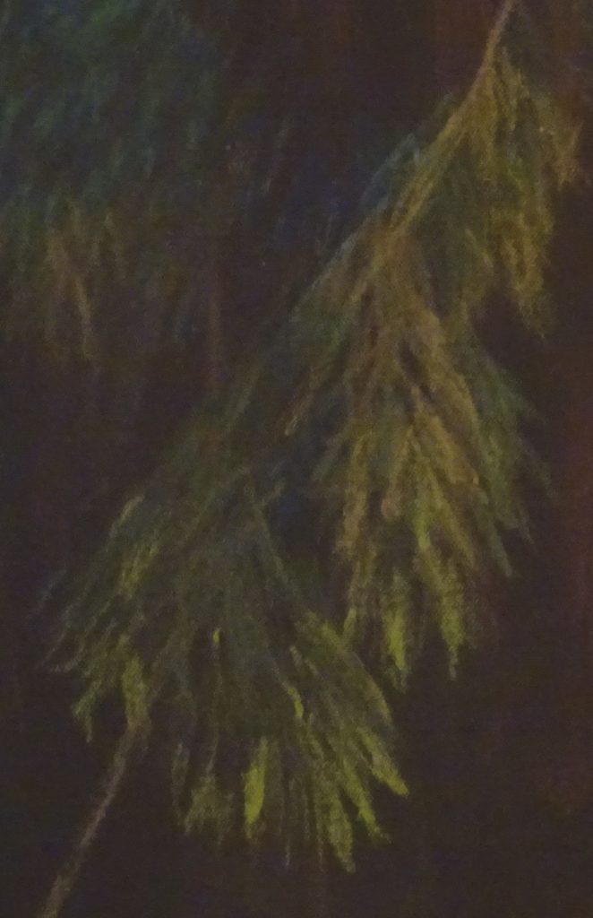
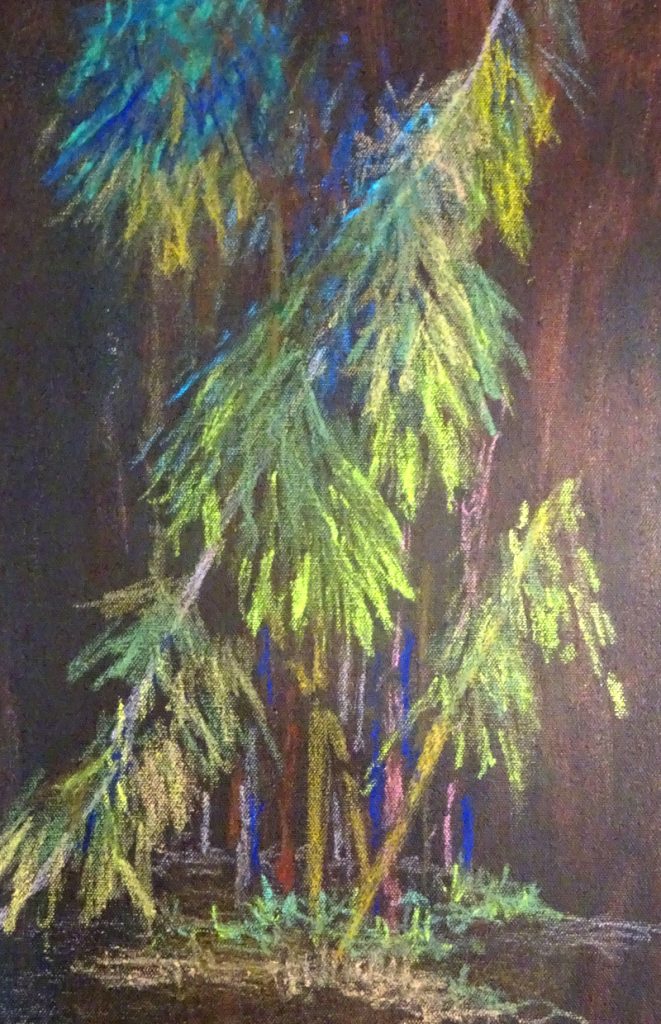
The blue stems are too bright – the intention was to have them fade into the background implying depth!  There is  light catching the edges of the foremost leaves, though the shapes of those in shadow needs more definition.  I haven’t tried using turps yet.  I may find the less crumbly set works better that way.

Another way forward may be to use the oil pastels in conjunction with acrylic underpainting, using them to add texture and definition after more exuberant brushwork.

Oil pastels again

I have changed the surface I work on this week (and next) to a loose canvas sheet stained with acrylic paint.  I decided to use a photo of bamboo I had painted, very successfully (by which I mean that I was thrilled with the result), in soft pastels.   I had painted the leaves in sharp downward stabbing motions so I thought the image might lend itself to oil pastels.

I have to say that this is an improvement on the previous attempt.  Certainly there is better adhesion and the fall of the leaves is engagingly presented.  The image is dark because I chose to tint the canvas in a warm dark brown and much more work needs to be done to create depth and light.  I feel encouraged to continue with this experiment – and it occurs to me that the crosses I used in painting “Shimmering in sunlight” ( page 29 in my book ” The Bridges of Dee” for those of you who have a copy!) would also work well.  Note to self:  find a new image and try it!

Oil Pastel experiments

For the next few weeks, I will be trying out some oil pastels I have been given.   Now I love soft pastels for their immediacy and for the variety of effects I can find.  I’ve seen some engaging paintings done in oil pastel, and wondered if they were a good substitute  for those who cannot tolerate the dust created when using soft pastels, or who don’t like the feel of them.

Well, of course, no medium is a substitute for another.  What was I thinking of!  Each has its own strengths and challenges.  At this early stage of exploration, I could find no correlation between the two, apart from the fact that you have the colour in your hand.  I’m using  mid-toned green mount board for my substrate for this first attempt.  Such work as I have seen used a firm coloured surface to work on.  I had been given two sets of oil pastels, and both are rather ancient, but I found an immediate difference in texture between them.

One set, the larger of the two named “Holbein”, were very oily, almost waxy when applied, and the surface was too smooth to accept the pastel evenly.  Also I had to scrub hard to increase the brightness, and ended by pushing off the pastel already applied.  The smaller un-named set were more granulated and adhered to the surface with less effort.  Further work discovered  a wide range of oiliness to granulation within each set depending on the colour.  Clearly there is a lot to learn about the pastels themselves, never mind how to apply them.

You can see the uncertain adherence of the pastel.  This could be because the surface was too smooth (or the pastels were too oily!)  so next week I’ll be using pre-stained canvas to work on.


Watercolour works!

Isn’t he charming!  No, this isn’t one of mine – it was painted by a student in my class this week.  She is working on a project in needlework related to the Amarna dig between the two World Wars – http://www.blog.virtuosewadventures.co.uk/wordpress/ the Dreams of Amarna  –  and finds painting helps to define and refine her images.

As always in painting, it’s not what you paint, but how you paint it that matters.  This was done without preliminary drawing, often the best way to achieve a vital painting. A painter friend of mine once said “You have to hype yourself up to paint in watercolour!”  Certainly it requires total concentration to work without an initial sketch.

The first pass in pale colour established the position and attitude of the figure, using both the tip and the body of the brush to win the shapes.  The brush strokes which followed established the solidity of the figure, shadows revealing the curve of back and buttocks.  Notice how some are wet in wet and some wet on dry.  It is the varied handling of  brush and paint which makes it work so well.  The variety is appealing, suggesting both the relentless sun and the passing of a moment.  Lost and found edges cast their spell and draw you in.

Well done, that girl!

Is this progress?

Well, progress of a kind.  I’m told he looks like a Roman emperor, and I think she now looks like a Red Indian, but at least they both pass as people.

As far as my brief is concerned, it is a bit like the curate’s egg.  There are places where the textures are driven by the underlying collage, though overall there is too much reliance on paint.  They both look rather menacing too, which was neither the original intention nor in character.

I’m considering whether I can learn any more from this experiment.  Maybe portraits were beyond my capabilities at this stage, given that I have not succeeded in painting a satisfactory portrait in oils as yet (much greater success rate in pastel) and a landscape or townscape would have provided  a better result.  I’m sufficiently intrigued to try the technique again, to see if I can take it past the  stage of working with someone else’s methods into something I can acknowledge as my own.