Pastel Post Office 4

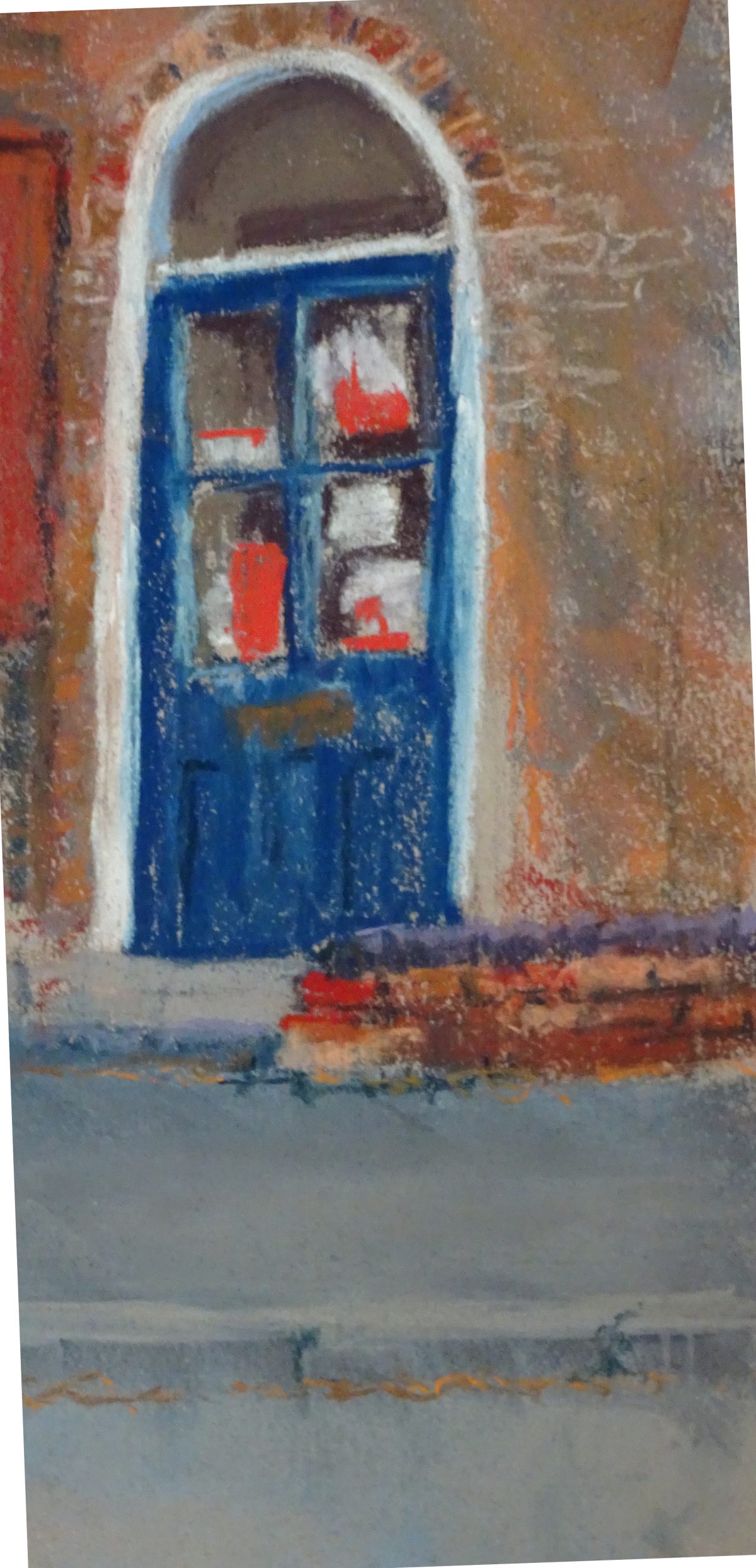
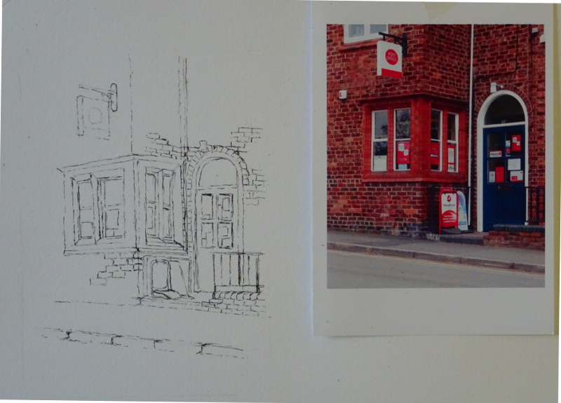
I used a T square to straighten the door frame!  Of course I worked over the guide line afterwards – after all my strictures on the use of rulers in drawings that are going to be painted, I couldn’t let it stand.  Indeed,  the frame is already too dominant.

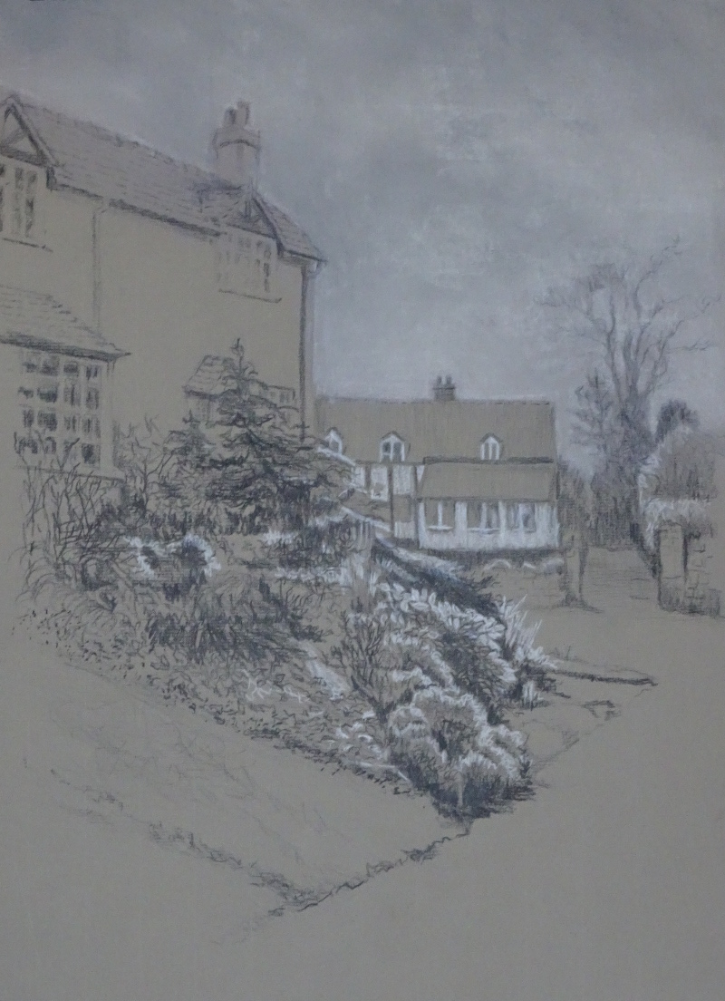
My good intentions to do work on this painting during the week remained just that.  The beautiful light we get in Summer encourages painting but the garden doesn’t stop growing,  It is enjoying the light too.

So we have the pastel, completed, and I’m reasonably happy with it,


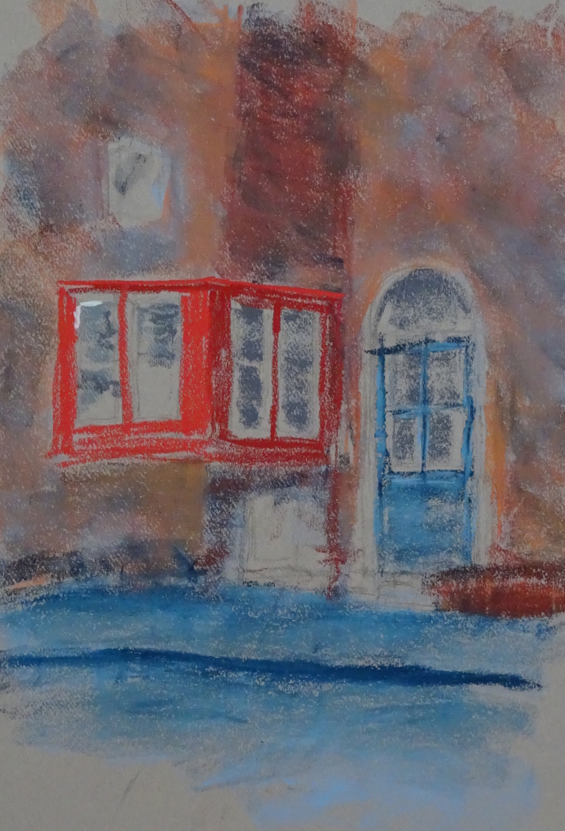
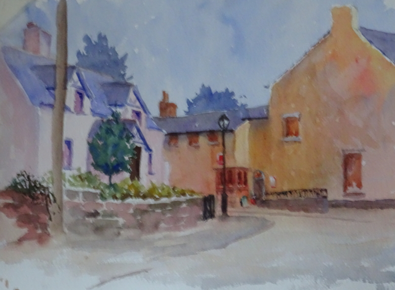
then the long view in watercolour, which I also like,  and finally,


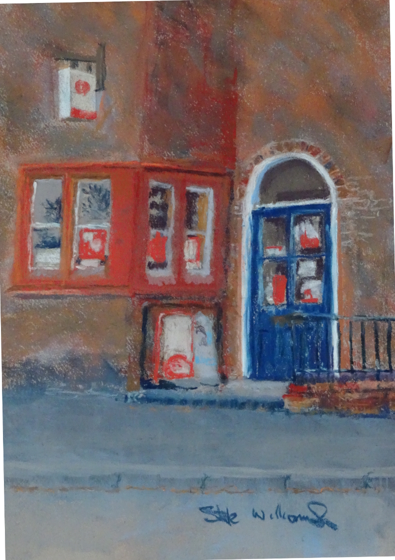
the line and wash which was less successful.  Indeed, I think I prefer it as line only!


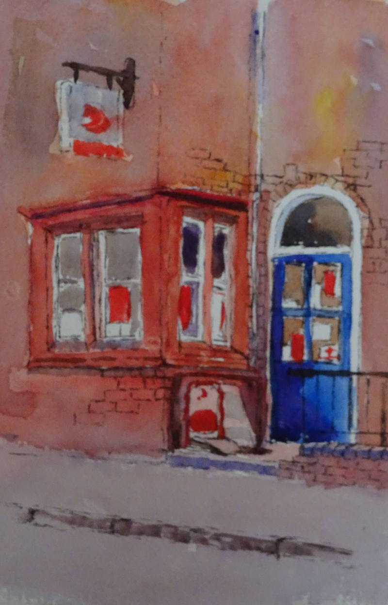
Who would think that I would ever prefer one of my drawings to a painting!

Pastel Post Office 3

This time I tackled the door.  I should have done the other window first, as leaping around a painting when making the second pass produces “currants in a bun” of detail – not the most encouraging vision of work in progress.  Indeed, I had intended to work on the window in my studio prior to demonstrating in class.   That’s good intentions for you!  However, for my class  I wanted to move on to the brick arch and the little wall, so I will try to fulfil my good intentions this week, ready for finishing off next lesson.

I’m delighted with the pavement edge, just one of those things that pastels do so well,  using a slightly dirty pastel on its edge and making small downward stroke instantly creates the grain and varied surface of the kerb.  A few judiciously placed joins and a sprinkle of the remains of autumn leaves, and there you have it.  The wall above is working  nicely.  One has to put a few bricks in at this definition.  They may all come out of the kiln the same shape, but they are all differently heat marked, and time has added its mite.

The arch of the door also has interesting bricks around it and is a feature worth noting.  It can be difficult to vary such small shapes as there is a tendency in all of us to make patterns even where there are none.  The beauty of pastel is that one can work on top of previous strokes and frequently the meld of colours and shades gives the desired effect.  However, the door frame is leaning over at an angle, and the little wall is going uphill instead of down, things I need to correct before next week!

Pastel Post Office 2

It’s detail time.  Since it’s the window itself which sparked my interest, I’m starting there.  I noticed as I went through the village that the reference photo I have is too red, both the bricks, and the window.  One of the advantages for working on site is that the vagaries of the printer don’t distort colour, but that is not an option I have.  In truth, I rarely pay much attention to the colouring in a photo.  Usually it’s too dull.  This time I had just renewed the colour cassette and the red was feeling its oats.

A quick pass of a browny orange over the brickwork proved useful in adjusting that.  The bright scarlet I had used on the window was easily reduced by brushing it off.  That didn’t move it all , but enough to restore the tooth to the paper.  Indeed, I had used it hurriedly towards the end of the demonstration to stress that light and shade give the same colour different tones, sometimes amounting to different colours entirely, especially if the light is bright.

Working more carefully I tried to delineate the intricacies of the moulded bricks, showing where they caught the light, almost pale blue on a reflective surface, and where recesses were enveloped in deep shadow.  There is a bit of exaggeration here  – I like that.  The windows themselves were reflecting the sky and the surrounding trees, which is great because that varies each pane, and there were notices attached to the panes too; all grist to the mill.  This is about half an hour’s painting, so there is a long way to go.

Pastel Post Office 1

Here is the first of my Thursday Blogs.

It looks like I’m a bit fixated on this Post Office window, but I know that different media do show different interpretations and I was not happy with my watercolour.  I felt it didn’t show why I was interested in the window (almost uniquely, I’m intending to try again in watercolour – it’s vanishingly rare for me to make a second attempt in the same media.  Perhaps I am fixated!)

This is the first pass.  I looked for all the colours I could see in the brickwork then, using the side of the pastel lightly overlaid them so that they blurred and melded.  You can use bright, intense colours this way as long as you don’t overdo it and use all the “tooth” in the paper (Canson Moonstone).  then I darked in return of the wall , using a darker red for the window, while my brightest red stood for the brighter part.  The pavement and road are too bright. I think that you can more easily tone things down that brighten them so I’m fairly sanguine about that.  It took about quarter of an hour to get this far – I do like pastel!


Black and White – the end

We left my black and white drawing with a mauve sky,  you may remember.  It was an improvement on the disaster which ensued when I tried to “wash” the sky with my watercolour pencils.  That idea would have worked except for the fact that the paper was not suitable for watercolour and I hadn’t the patience to solemnly shade with the pencil.  Moral: use the correct paper – or even acquire some patience!

Although the watercolour pencil did rub out to some extent it didn’t move entirely, leaving an intermittent waxy surface which didn’t take pastel.  (Something tells me I should stop digging this hole.)  So the patchy mauve sky was pretty awful, too.

Plan C (D? E?) I would dust off the mauve and save the situation using grey and white pastel.  I think it’s better because the white residue of the watercolour pencils is less evident- while I also think I was right that the sky needed something.  It’s a cautionary tale nonetheless.

I often post about the work I am doing in class, so in future I am planning on posting on Thursdays instead of Tuesdays. My Wednesday students will have a reference on progress so far.  That’s not to say I wont be wandering down other byways as the fancy takes me!

Line and Wash 2

I found this quite difficult to do as I felt a need to respect the lines.  It was quite inhibiting.  So there are areas where I should have taken more care and didn’t because I was fighting to paint loosely.  Conversely, there are areas where I could have taken more liberties and didn’t because I was constrained by the lines.  Sigh.

When I remembered how to paint, the picture came alive – the door for instance.  What I was doing including the narrow white pipe at the corner near the door, I don’t know, while the wall to the left of it should be a bit darker to mark the return.  I like the brickwork , just enough to show that the wall is brick built but not too much so as to overwhelm with detail.  The Ruabon bricks and mouldings are a good colour, too.

Somehow, the painting doesn’t yet say why I wanted to paint it – more work this week.  But seeing a photo of it has given me clues on what needs correction.