Farndon Cottages 2

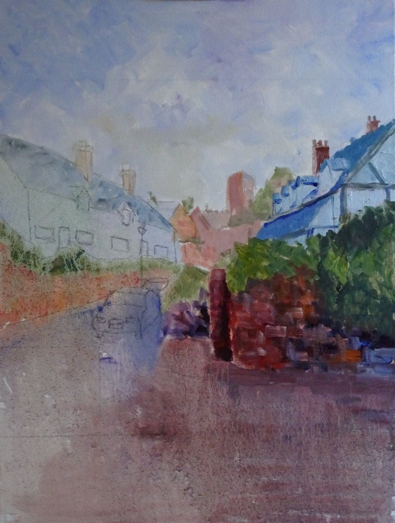
We are making progress! As you can see,  I have done some work on the white cottages on the left of the picture.  I’m still painting loosely, indicating rather than defining.   Some of the underpainting is showing through particularly near the guttering.  The roofs are tiled rather than slate, so that zing of red balances the warm tones on the wall under the timber framed cottage.  I put in the car – fortuitously it was there when I took my photographs – for I think it gives life and warmth to the painting.  It won’t be quite so “important” when I’ve finished, but, after all,  villages are lived in.  And I found a fence I hadn’t noticed.   All those diagonal lines should lead the eye to the church tower, but maybe the whiteness of the cottages enhanced by the red roofs can win the day.  We’ll see.

Now it was the turn of that tower and the building
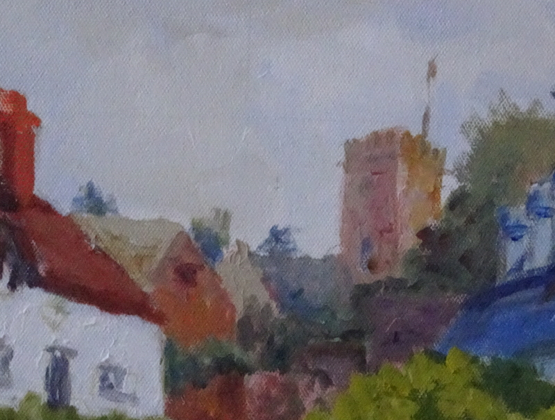
s in the background.  It makes a rather charming picture on its own!  I have used a small brush and added dabs of “near miss” colour to trees, houses and the tower, keeping the same tonal value.  This just breaks up the surface so adds interest without drawing huge attention to itself.  Only when someone stays to look more carefully will such detail be noticed, giving secret pleasure.  It’s a sort of reward  for stopping to look at my painting; and it’s reward to me for I take such pleasure myself in painting like this.

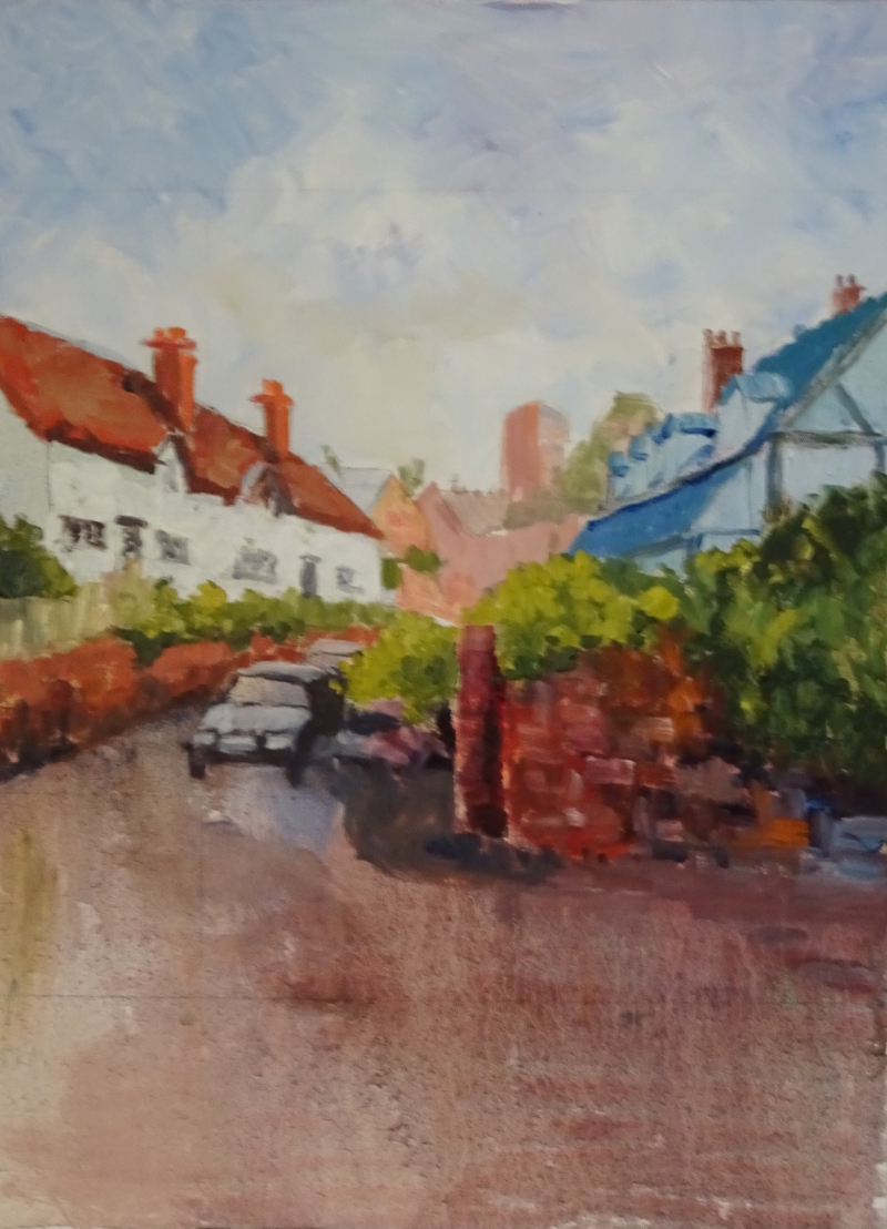
There’s lots more to do, about another 4 hours I reckon, so further progress will be slow but satisfying.

The blank canvas

How to get started can be a real pain.  Painter’s block, even when you have a deadline – especially when you have a deadline, for that’s when it strikes most often for me –  is a hazard of the occupation.

It’s easiest to deal with in oils or acrylics, in fact it very rarely occurs for me with these paints.  All  need to do is paint the entire canvas in a neutral colour.  In my case that can mean Raw Sienna,though often means Orange, which isn’t very neutral, I grant you, but it doesn’t half get the painting juices going. It’s not hard to get going with the canvas already “ruined”.  I am more likely to be blocked at a later stage, needing to progress the painting but unable to settle what I should do next.  Then I fiddle about at the edges to work my way into the painting again.

The real difficulty is in painting watercolours.  The white paper is an essential part of the process, so you can’t paint it out.  Even a light pencil drawing does not always help. One way I came across in “Painting People in Watercolour” by Alex Powers was to flick paint onto the surface randomly.  The white surface in broken – the paper is “ruined” – it can only get better. It certainly works if your style can accommodate the splashes, but even those flicks have to be done confidently.  And that is the crux of the matter.   Confidence, real or pretended, is the answer.

There is some help in working from light tones to dark, the classic technique in painting watercolours, so that your excursions tiptoe onto the paper.  But the unfailing method I use, especially when painting without drawing  some guide lines first, is to have everything ready,  pull my concentration tightly onto the job in hand, have the finished piece in mind, convince myself that I can do it, and plunge in. It’s exhausting.  Whoever claims that painting is a relaxation couldn’t be more wrong.


Farndon cottages

For the past two weeks, I have been working on this scene in my weekly class to demonstrate one way of painting buildings.  In the first demonstration, I washed in glazes, letting down the oil paints with copious amounts of “Zest-it”, as an underpainting for the buildings.  You can see this thin paint on the left had side of the picture below.  I have treated the sky and the distant church tower more immediately with thicker paint which should not need much modification later.

The passage on the right hand side shows the beginning of the overpainting. Not a lot of the underpainting is left, but just enough shows to give depth to the painted surface.  The main value to me is that the thinned paint uses the white canvas to create lighter tones, just as one does in watercolour.  This in turn means that the true colour remains, not deadened by white paint, so I am encouraged to use true colour for the second pass – more vibrant and alive.  I used yellow to lighten my greens, reserving a blued white for the cottages themselves.  I am a bit cross that  I didn’t make my underpainting of the cottages darker, for then I would not have needed to repaint the wooden beams.  Next week I shall work on the white cottages on the left.

Lakeland Waterfall

This is one I did earlier – about ten years ago!  I was decidedly chuffed with it at the time and the years have not diminished my chuffedness.

There is absolutely no back or middle ground here; all is foreground.  It was a rather small waterfall, which you can judge by looking at the leaves of the sapling on the left of the picture.  There are so many differing textures , mosses, shrubs, rocks, grasses and water, both still and moving.  I had a field day didn’t I?  The red-browns and oranges are working their spells on the greens and blues, but are totally outclassed by the moving water.

My eye goes to the flat rock bearing the brunt of the fall, then follows the crack in the rock to the bushes above.  These curve over the fall where the topmost leaves of the sapling help the journey down to the stream.  Sometimes the trip is in the reverse order – and I just love the way the waterfall curves to the right in a series of miniature falls.