(Black and White) and Colour Mark 2

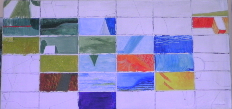
I decided that the best thing to do was introduce one colour at a time and see what happened.  Orange was my first choice, a good, strong, cheerful colour.  That’s him near the middle of the canvas.  Now orange partners well with turquoises and blues, so I tentatively surrounded my orange tile with bluish ones trying always to keep to the tones in my corresponding reference. The lemon yellow tile was my next offering, which in turn suggested a grey-green.  I used this on quite a number of tiles on the left hand side, though I think the sharper green tiles are a mistake, taking too far from my original blues.

Then I stood back and looked at it for a while.  The juxtaposition of oranges blues and greens made me think of a fish pond  so I explored that idea by introducing textures on some of the tiles.  There are some ripples on the blue tiles and some scaly shapes on the orange ones.  I don’t think the detail should dominate or over-complicate matters, and I haven’t worked out what sort of detail I should suggest on the green Lilypad!  Work in Progress!


Black and White, and Colour

My students have been working on tonal value this term.  We started with a grey scale and a black and white print of  a still life.

As you can see, there is a pleasing collection of simple shapes.  All were white, but the varying depths of shadow gave a variety of tones.  These we checked against the grey scale to assess just how dark a white surface can be!  And painting the image wasn’t too easy either.  It’s so hard to believe that “white” can be that dark.

The next part of the exercise was to reinterpret the image in any way possible.  some turned the shapes into buildings, some selected one or two shapes to create their own design in colour, one even found ballerinas in the upper outline!  I decided to cut the whole shape into “tiles”, rearrange them, and use colour to paint the tones on each segment.  This gives you some idea of the guidelines I used.  I had seen an image of an entirely white set of tiles mounted in sunlight, the varying raised lines on each tile caught the light, and the whole image changed as the sun passed over it.  I was hoping to achieve something as interesting using colour.  The lines you see show the top of the little box and the curve of the drum.

Meander Book Treasures

The pockets in the book are very small by my standards, so I thought I’d try portraits in watercolour.   They are largely foreground making such detail as I could manage contribute usefully to the finished painting.  That sounds like a piece of woolly thinking, and it is!  I don’t know where I’m going with this.

The lady is my first attempt.  She graced the front cover of a book I am reading at the moment, and I loved her headdress.  My new-found courage to pick up a pencil and draw helped me here – none of my usual “crutches” would have worked at this size anyway.  I sketched her out with surprising ease, certainly enough to encourage me to introduce paint.  I enjoyed the delicacy and lightness of touch demanded by working so small. (Sorry to be going on about “Small”, but it really is new ground for me).  She looks younger, pert even, in comparison with the original image.

Faces, then are possible.  I own a book of self-portraits,  “A Face to the World” by Laura Cumming, a great study if you are interested in painting and paintings, which fell open at Jan van Eych wearing his trademark red turban.  This is turning into a “hats” project!  He is contemporary with my lady and very striking.  I really enjoyed his many folded turban.


My second painting is a painter, and my favourite of all time is Turner.  I discovered him in the Lady Lever Art Gallery aged about 15, and thought I found an unrecognised genius!  His self-portrait is of his young self and he isn’t wearing a hat. It’s a very direct stare and as it has good strong shapes making it smaller will be possible.  It’s interesting how dark the darks are in these portraits, even on faces.


Dee in Flood – Farndon II

Sunshine arrives!
Sunshine arrives!

Well, that looks better!  Altogether more cheerful! which is what I had in mind.  The painting is not longer influenced by the original one – the lighting has changed. The picture is no longer brooding, mysterious perhaps, with a storm brewing.  In fact the storm had passed leaving an immense amount of flood water, but nothing unusual to residents, as the flood plain of the Dee is still used to manage the river.  Winter floods are part of scene most years.

I’m still learning about my camera and what happens when I move a photo on to the blog.  The colours in the painting are brighter than my first pass but not as glowing as they appear in this photo.  The apparent florescent pink is more brown so does not dominate.  The high water level and the reflected light under the bridge arches give an altogether lighter feel to the piece.  It Seems to me that blogs are more about photography than I thought.