Progress “in the sunshine”

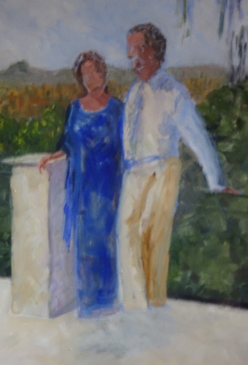
Using my sketch as a guide, I have altered the pose and the colouring of my pair. I think it already looks more relaxed and friendly.  The new colours are altering the balance of the painting, and I am preferring the new view.

His creamy trousers are lightening the tone, his outstretched arm opening up the pose, and when he gets his feet …..

Meanwhile, her choice of dress goes happily with the greens and blues of the foliage, but it played havoc with the turquoise vase at her elbow.  Now these vases are a source of joy to her, but when I took the reference photo, they were temporarily  not on display for safety during building work.  None of us thought about them!  What to do?

I could change the colour of her dress – but I liked what the present colour was doing to the painting.  I could change the colour of the vases though I don’t think that would go down too well.  In the end, I took the one behind her out of the painting altogether.  There is the large, very glossy vase and its attendant dove in the foreground which was sufficiently distant from her dress for an unhappiness to be avoided,  and she looks less crowded now that it has gone.

In the Sunshine again.

Is it really September 4th 2017 when I last worked on this painting?  Much has happened since then, not least I have finally got a good working photo of the pair on the identical terrace.  I had to go to Nice to get it (but that was fun) and  the pose has more animation now.

I have painted out his head and part of hers, and also painted out the feet.  These areas had begun to show a little “halo” of adjustments, not quite matching the background, looking dirty.  I don’t think that I need to paint out the rest of the figures – I think I can change them as necessary.  We have a different colour scheme which will help, and the new pose is encouraging as it makes the painting more friendly.


I have done a line drawing to help me position the figures.  Her head is not quite right as she is looking at him and smiling!  But the figures themselves are right relative to each other.  She has opted for a long dress, which makes things easier, and his pose means that I don’t have to do him full face (and he is pleased about that).  This looks like a win-win situation!

Kingfisher

You may remember I have quite a menagerie in my sitting room, as mentioned in my posts about the Honourable Giver of Contentment.  I have added to my aviary today by creating this kingfisher on the fire screen.

The screen is tall, not quite shoulder high, and has seem various incarnations over the years.  Originally I covered it with a piece of lace curtain and sprayed gold paint at it – very effective when the lace was removed.  Later I chose to  paint a stencil of Chrysanthemums, also in gold, enlarged from a lampshade design.  But this time, colour was needed and bird life is a theme (dragons can fly!).

After all that concentration on watercolour, I have returned to acrylics.   This is a “one chance” painting – if I get it wrong, I’ll have to repaint the entire screen again!

I started with a light pencil sketch (freehand, Yeh!!!)  then laid out my acrylics.  For some reason, I had no Prussian Blue, so used Cerulean Blue Dark and Phthalo Green to achieve bluey green.  The Cadmiums, Red and Yellow provided orange, shading with Burnt Sienna.  The markings and the colours are so distinctive that it’s difficult to go wrong.

Here he is in situ with The Cat Person, sublimely oblivious of his presence, at his feet.  I’m not convinced by the branch, and I don’t know how long it will be before I feel moved to do something about that!  However, with the Honourable Giver of Contentment on his left,  and the exuberant macaws on the curtains, he  (and pussy) sit well in the room.

A monastery door

When we visited the Cathedral in Belem we also took the opportunity to explore the monastery attached to it.  The stonework was as exuberantly decorated as the church, The two storey cloisters, something I didn’t even know existed, were stunning, and I don’t use the word lightly.  They were vast, full of sunlight and shadow, every door, window, pillar, decorated and decorated again.

I have chosen one of the less excited doors to paint. Capturing this much decoration was going to be a struggle.

In fact the only way to do it justice would be do do a close-up of one small section, but I’m going to continue with this door.  A general wash of Yellow Ochre and my new friend, Burnt Umber, provided a backcloth to the more detailed work.  I did use a line drawing to work out the complicated aperture.  The dark green door helped define the shapes and the bell was a gift, the Prussian Blue so near and yet so far in colour terms.

Details of the carving, using Burnt Umber and a fine brush, were hard to achieve.  I didn’t want to be too mannered yet there was a lot to say in a small space.  In the end, I aimed to show the shadows as I saw them, hoping to place them with sufficient accuracy to create the illusion.  I’m relative pleased with the result, but the only way  to do justice to to the stone craft would be to do a small section enlarged.

An old street completed

We soldiered on, working on the building on the left.  The shutters on either side of the open window went in with a single stroke of a flat brush, then the same flat brush with  a deeper grey-blue used vertically so that only the tips of the brush hairs touched the surface hopped down the shape.  That made the louvres – they only needed a trifle more dark at their edges to become convincing. Flowers, pots and greenery  covered the wall adequately and decoratively.  Using varying tones of reds and greens added depth, and the pots were great fun.

The strong shadow on the ground,( it was very sunny), made me see that the walls were too warm.  It seemed a pity to lose the colour, but “needs must”, so I blued it with a light wash after all was very dry.  The final touch was the opaque white on the heads and shoulders of two of the people.

An old street

We visited two or three old villages as well as Old Nice on my recent visit to the south of France so that I don’t recall which one this street was in!  Nor did I take notes – the ambience was too restful for that.  (I’ll have to do better on my next holiday.)

The light is streaming down the street so most of the buildings are in shadow or glancing sunshine and the people are back lit.  It’s quite complicated at first sight but “Hazel’s dictum”works in this scene, too.

I began by dropping in the sky then a light wash of Burnt Umber on all the buildings.  This colour is less red than Burnt Sienna and serves well as the creamy stone in indirect sun.  The full sun is only on the top of the steps and on the heads and shoulders of the people.  When the wash was nearly dry I deepened the tone on the surfaces directly facing me, finally giving them a light wash of Ultramarine Blue  after  they had dried.  Now I had the buildings marching up the street and could begin on the detail.

Starting on the right,  I put in the tones and colours I could see, not many from this angle, finishing off with the window grill.  Advancing up the wall, I indicated the shadows cast by the open shutter and the deep tone of the window recess.  Downstairs had more flowers and a grill.  The next building shows its face only as a thin slither of light, framed by the shadowed  walls.  How effective that slither is! Just imagine the painting without it.  A roof line and vague window shapes dressed the further building, and we have arrived at the people walking over the crest of a little hill.  These are very simply indicated using colours already in the painting, and I’ve missed the highlights on two of them so a little opaque white will be called for at the end.   (I use Designer’s Gouache for that and it wanders if you work on top of it).

The building at the back of the street is actually on the downward slope of the road, the top of its heavy door helping to thrust the figures forward.  There is a huge terracotta pot on a high wall next, its greenery largely silhouetted against the sky.  The wall it’s standing on disappears behind another terracotta pot at ground level.

By working the detail starting from a fixed spot  (it doesn’t have to be the side) extra brush strokes “grow” the painting.  This is an encouraging way  to paint as the picture develops under your eye, and concentration on one area helps you to observe more.

Glimpsed in Nice

Just one of those moments when you see something paintable – and you have your camera with you.  Everything was just right, the colouring, the shapes, the sunlight.

Since the dome is strikingly bluey-green (I used Viridian neat with Ultramarine Violet for the darker places) it seemed sensible to use dilute Prussian Blue for the sky, laid in on previously dampened paper.  Then I HAD to do the dome, such an exciting colour, such a neat shape.  The building was painted warm golden yellow, so Raw Sienna was called into play, and the bright sun gave me crisp,  fairly simple decorative details, (certainly more simple than the extravagances of Belem Cathedral).  More intense mixture of Raw Sienna defined the  shadows in this bright sunny painting, with the addition of Ultramarine Violet for the really dark places.

At this stage, I took a photo  – in case I ruined the whole painting by inserting the trees.  It works fine as it is but element of surprise, of just a glimpse of colour, adds to the story.   In the event, I think the trees are indeed an interesting addition providing context and colour balance.  All the colours are in the yellow/blue sector of the colour wheel.  You don’t have to have opposites to make a good painting.    The darker tree is Viridian with the addition of Ultramarine Violet, while the lighter, in both colour and texture is Viridian this time with Aureolin.

Belem Cathedral

This is a rather hilarious attempt at the Cathedral.  There is no way that a person with my lack of patience with fiddly detail is going to do justice to this building.   You will remember when I was discussing the Belem Tower window  that I was wrestling with the “decoration on decoration” that is the norm for this period of Portuguese  history.  The Cathedral takes this style into overdrive.  But I liked the monochrome simplicity of the colour enough to give it a go.

I used Ultramarine Blue for the sky, the added Indigo to the mix to tone it down a bit.  Bearing in mind Hazel’s dictum ” shape first, detail later”,  I gave form to the dome, windows and door, and the returns in the wall.  I had fun trying to leave out the white flying buttresses in front of the dome and the attached ones on the distant building; and there were the decorative spikes on top of the walls.    Then it was a case of entering as much detail as I could before my patience ran out!

The few people give scale to the building.  I gave one or two of them red coats to spice up the blue.

A copper pot

This pot is in Lisbon near the river at Belem – you may remember the window of the tower at Belem I painted a short time ago.  There is a restaurant which claims that its Pastel da Nata with a special Belem twist is superior to all others.  As we were addicted to these pastries – and that doesn’t begin to describe their deliciousness – we had to try them.  To be honest, we’d have tried them anyway.  As expected,  since you can’t improve on the best, we couldn’t tell the difference.    But in this restaurant was this pot.

Isn’t it a cracker!  My frequent response to “where shall I begin?” is “with the bit you like best” so I started with the pot which, I am delighted to say, fell off the brush.  Fortuitously, the restaurant furniture was a lovely blue, just what the orangey copper tones loved.  Floor and plinth were a cool white and the light dancing on the greenery (which liked the copper, too) completed the picture.

A pot of flowers – completed

The first task was to complete the flowers. I used the same colours and technique as before.   It truly was a mass of exuberant colour so I didn’t try to differentiate the individual flowers too much, relying of light and shade to give vitality.

The pillar now looked too mauve in comparison to the pot and its stand, but that was soon corrected by a light wash of the Ultramarine Violet and Yellow Ochre mix and the introduction of that mix in a deeper tone in the darkest of the shadows.

I thought about making more of the setting, but decided against it.  It was sufficiently indicated to provide a backcloth to the main actors.

I’m reasonably pleased with this – flowers were never my favourite thing, and this is a more coherent attempt than the first one I showed you.