The Arch

I’ve done more pencil work on this and then added both watercolour and just water.

First, I continued the garden on the right hand side in watercolour pencil.  The deep shadow at the foot of the arch anchored it to the earth while the flowering bush was a welcome contrast to the very green border on the other side.    The absence of any distance beyond the trellis fence emphasises that this is my garden, with only the oak as a borrowed landscape.

The addition of water to the pencil marks increases their density so that they are darker or brighter than the untouched marks. It’s a very entertaining thing to do – It feels a bit like those e-cards growing colour before your very eyes!  I was able to thin the branches of the spindly lilac on the left.  I had added dark blue pencil to increase the depth of the shadow.  it scarcely showed until water was added.  The lawn and the oak foliage were watercolour paint laid in with a brush.

I’m reasonably pleased with it.

“My Garden”

I’ve edged up to this one.  I am surprised how daunted I still am about painting “in a book”.  I remember being very taken with a painting journal a friend of mine would do during every holiday, her text and her illustrations.  Even lines of washing have a different resonance when waving in an Italian breeze.  I loved the idea but never attempted it myself.

Something structural, then – it’s always easier with straight lines defining areas.  I have a rather pleasing photo on an arch leading into a little paved part of my garden.  It has a classic shape, with simple bushy mounds around and a flat lawn in front.  A few sketched lines gave me a map of the design and I started tentatively with watercolour pencils.  The plan seems to have worked since I got something down and am not staring at a blank page.

I began with the terracotta pot in the foreground.  That worked so I was encouraged to grow the painting from there, gradually rising through the bushes to the woodwork itself.  The old oak beyond the fence shows signs of being successful. Colours and tones are limited, but will blend later when/if I add brushwork.  I’m not thrilled with the greenery so I hope I can rescue it with a brush!

Thoughts on the present discontent

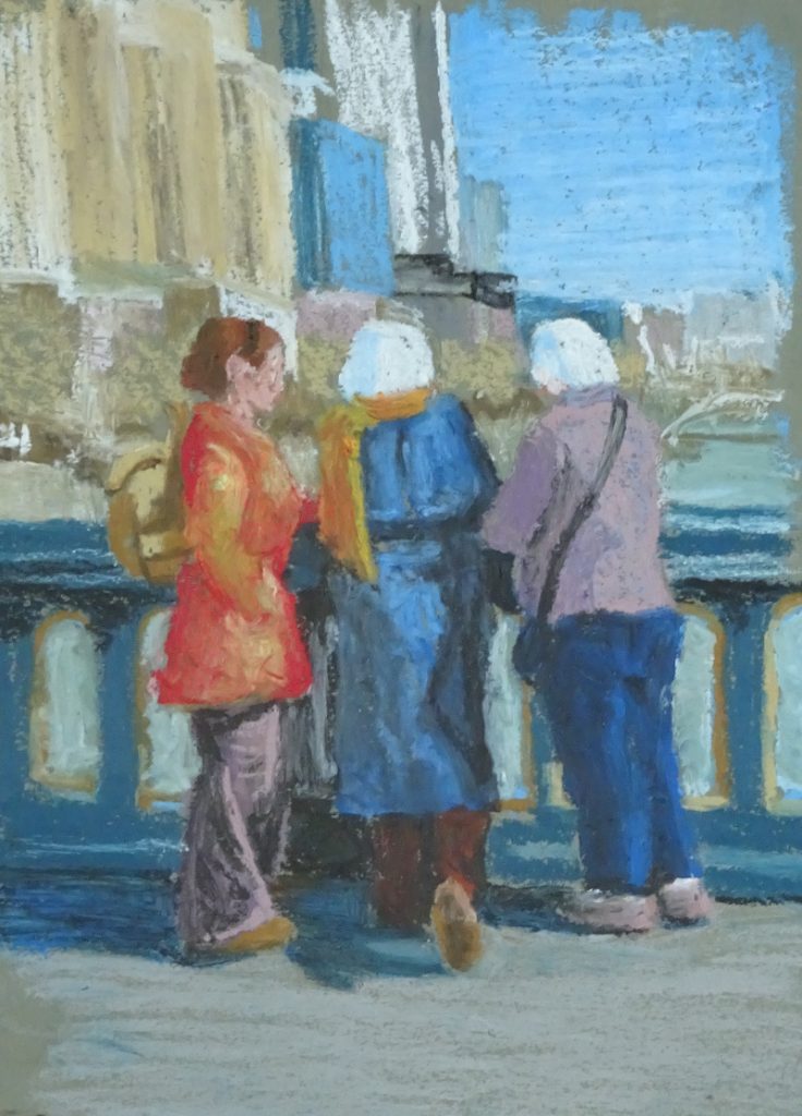
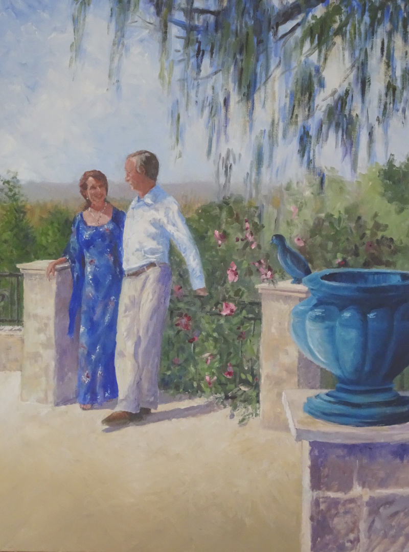
The discontent is not the current Solitude.  It concerns the rediscovery of a Layflat Sketch Pad I bought a month or two after the publication of my book “The Bridges of Dee”, when I was feeling artistically rudderless.  I had been painting the bridges pictured therein for some years, a very strong focus, and now I had none.  Being somewhat circumscribed by caring responsibilities, I couldn’t go as far as thought might take me (my other river, the Tyne? more bridges? Chester?).

Inspired by a article in either “The Artist” or “Leisure Painter”, I decided to make a painterly record of the garden.    The advantage of the layflat layout is that you can paint/draw across the fold so a painting could grow sideways if necessary, and gardens do grow.  Unfortunately I hit a “only painting rubbish” phase and was inhibited by the acres of white paper, and the idea of a rubbish painting trapped in a book!  I’m no better off now either.  As soon as I saw it, the old doubts reappeared, even though my paintings, currently, are not rubbish.

What to do?  Displacement activity required.  How about starting with the title page – it is a book, after all?  What do I call it?  The Garden, My Garden, Garden, Gardening Notes, Flowers in my Garden, Heaven on Earth? (eek! I say,steady on). And what font?  and where to put the title?  Up high on the page with wisteria drooping from it? In the middle surrounded by a wreath of summer flowers? Bottom right, alone?

Some decisions have been made, title – My Garden;  font – my own handwriting, which isn’t neat but probably has a closer affinity to the garden than a more formal font.  I’m not an accomplished flower painter, so although I’m attracted to the wisteria idea (the crossbar of the pergola would be a good place to sign) I’m a lot nervous about launching into flowers on page one.   Come on, Steve! You’ve got to start somewhere!

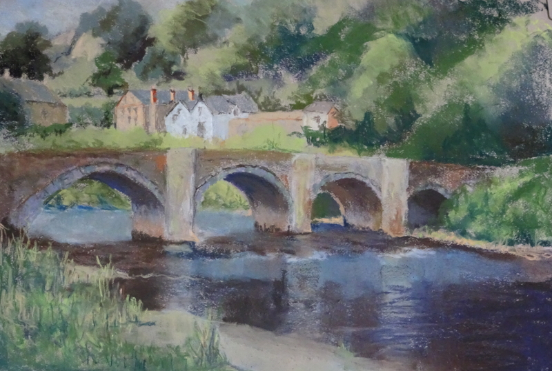
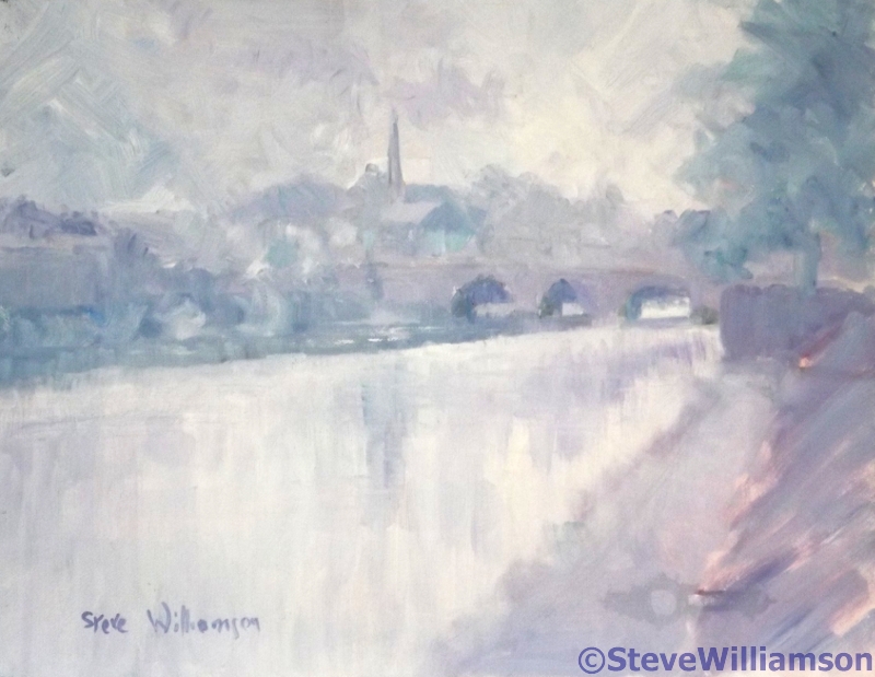
Because I don’t like a post without a picture, I’ve included one from the book.  It’s the Old Dee Bridge on a misty morning.
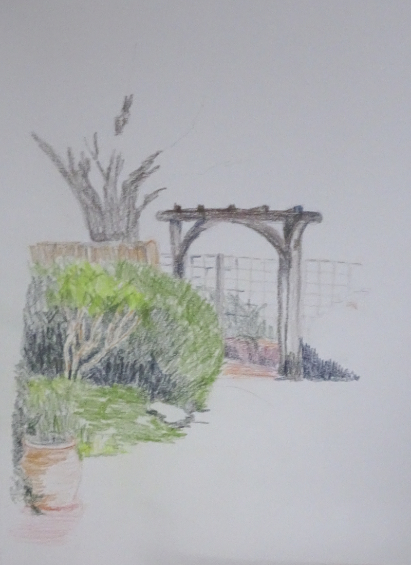
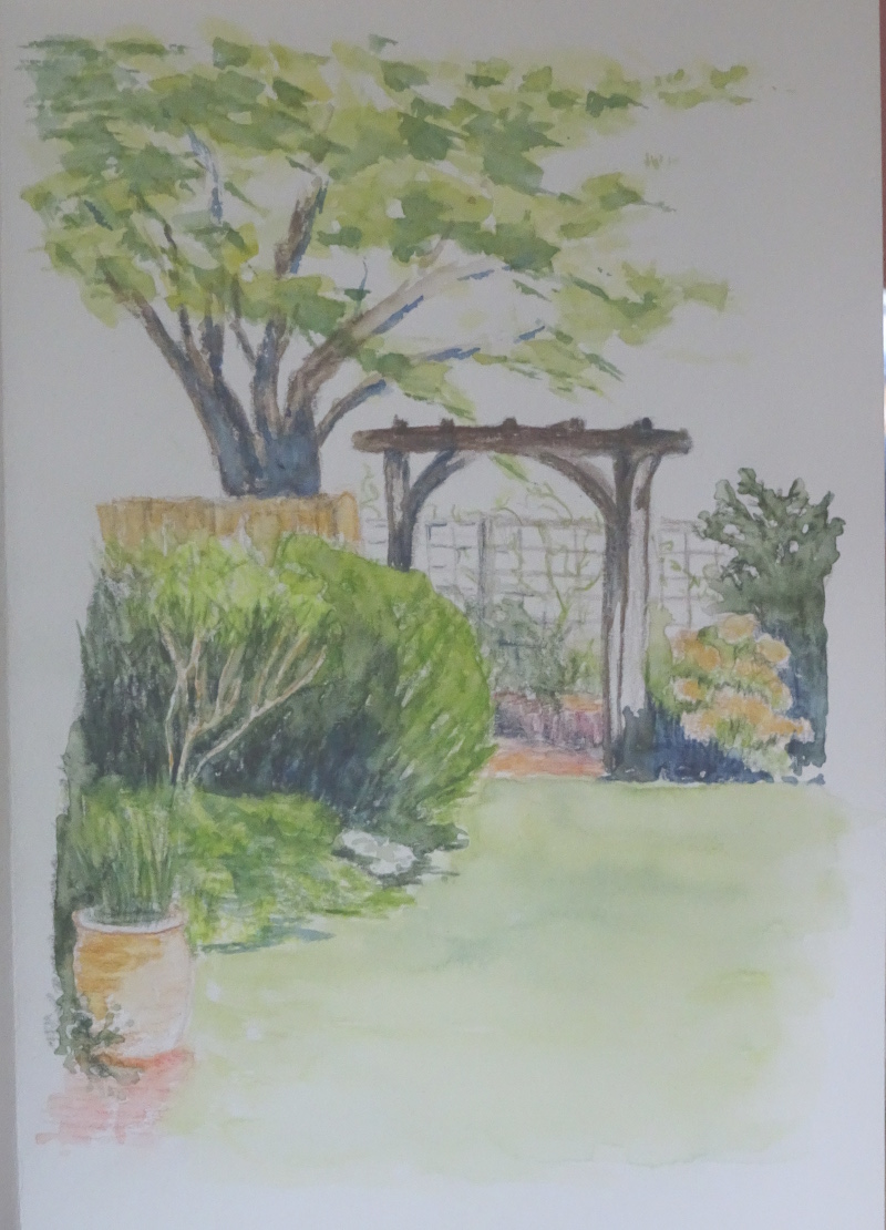
Banksia spinulosa

These striking “candles” are about man-high, borne on woody branches with thick needle leaves, close to the ground , for all the world like part of a giant’s  Christmas tree.  The colour  is bright, especially in shade, while the tiny flower stalks growing at right angle to the stem give a bristly appearance.  This is a return to watercolour, and it must have worked or I wouldn’t be showing it to you!

When I first painted in watercolour, I used a flat brush as the shape was familiar to me coming as I did from oil painting.  This seemed an ideal subject to return to that brush since everything is so angular.  The colour palette is Indian Yellow, Aureolin, and Burnt Sienna for the flowers and Prussian Blue with Aureolin for the leaves. Burnt Sienna was added for the real darks.  The composition works because of the strong contrasts so that the “candles” sing out, and the light, brushing their tops, is emphasised.  But painting is unfinished  – the sides are too clean-cut.We need the bristles!

I have scratched out the bristles with a craft knife, taking care to make my scratches at right angles except for the tops where they curve outwards.  They are only slight but show wonderfully against the dark background.   Some tiny horizontal taps of Burnt Sienna ruffle up the body of the “candle”, while the spiky needles have added darks all using the flat edge of the brush.  Played for and got, I would say!

Homage to Vincent

I was quite taken with the effectiveness of the directional strokes in the last painting and they led me naturally to Vincent Van Gogh.  I’ve attempted to copy his painting of the old peasant in his straw hat and blue smock twice, once in oils to try and work out how he painted (there is such vigour, such vitality in his brush strokes, and it’s not so easy to do as it looks), and once in watercolour (!) as part of my Meander Treasures (September 2017).   And I had a photo of A Hat …….

This is yet another example of so little saying so much.   Like Van Gogh, I have eliminated all background detail, and attempted no variation in tone either, the perfect foil for a simple image.  The hat and sunglasses, face, scarf and blouse are all simple shapes in block colour.   A warm, browny-red background thrusts the figure forward and sings beautifully with  cool greens and blue/white.  Lilac cream hat and green scarf  frame the half shadowed face.  Despite the eyes being lost in shadow (I didn’t even attempt them), there is no doubt she is looking at you in a friendly fashion.

The counter-change, the contrast of strongly dark and light tones invest the image with a presence of its own.  It ate up a lot of oil pastel, but I’m not repining, for I find to my surprise that this is a good medium to work in.

Looking down the Yarra

Here is another painting for my possible Australian Exhibition – I might even have them all done if this Solitude continues!  It is of three of us standing on a bridge in Melbourne looking down the Yarra river.  This is late July there, so Winter-time but sunny.

I’m using oil pastels.  I have been exploring what I can do with them to keep ahead of those of my students interested in this medium!  I’ve tried blending them, but my preferred painting method is to retain brush, knife or pastel marks.  I like the vigour they impart to a picture.  This image is nicely chunky so strong marks are exactly right, and the three people are very individual in colour and pose, the obvious focus .

The painting is done on mid green mount board.  I think it helps as there are no unintended bits of white to distract the viewer.  Strange, isn’t it!  I love those flecks of white in watercolour, but find them bothersome in any other medium.  The midtone disappears happily into the other tones.

The buildings and sky are blocks of colour, the pastel used firmly in one direction only (this is the sky, these are buildings,so there).   My new oil pastels go on thickly enough if I push hard    Looking at them again I think the white should be calmed down a bit so that the white hair stands out.  But the buildings are there merely to provide context and some perspective.  I haven’t put the windows in – oil pastels and me don’t do detail.    The figures are created in blocks of colour too, with high contrasts to suggest the sunlight.  Such blending as has occurred is the natural result a working one pastel over another.   How little one needs to define an image!  I recognise these people though there are no details to help; my most successful oil pastel to date.

Carrog Bridge – pastel

You will remember I found this unfinished painting when tidying the studio.  It seemed like a good start, more dreamy that the oil I did for the book, more softly coloured.   However it is practically impossible, even in pastel where exactly the same colours and tones are to hand, to recall the prevailing mood of myself and my audience – this was a demonstration – and, in addition, I have acquired new pastels and been through uncertain times painting-wise.

This is how I continued.    I breezed along forming the right hand trees, inserting the nearside bank, titivating the bridge, having fun.  When I sat back to look, I was thoroughly displeased with myself.  It’s not clear from this photo but the new trees  almost sock you in  the eye, the greens are so different and far too bright; the river looks like a canal; and I am decidedly unhappy about the grasses on the near bank.  They look like sausage fingers, despairingly climbing high to gain authenticity.    I seem to have used the same technique for ages and it’s time I found a new one.

I took a serious brush to the recalcitrant parts and removed the lot.  It’s not an improvement but it did wonders for my frustration.

Now  I tried matching the colours and tones I had originally used for the trees, and am thinking about grass.

Kingfisher

I have a fire screen in my sitting room that I had decorated with a kingfisher(as you do) painted in acrylic.  This is the third or fourth incarnation of the screen as it changes every time we paint the walls a different colour.  It’s been pale yellow, peach, bluey-green, deep crimson and now lime green.  The  designs have varied with the decor,  gold chrysanthemums stencilled on the crimson being memorable.

This design was free hand, originally done when I was struggling to find the sweet spot in painting, and I was never happy with it.  The kingfisher herself was fine but the branch she sat on was just wrong.   I’d  shown a stem rising from the water, meeting her perching branch at right angle(?!) that then tailed off in an unconvincing way.

Lock down (I prefer “Solitude” as it sounds like I chose it!) led me to the garage for gardening purposes but also provided a tin secreting the remains of lime green paint.   Paint out the old and paint in the new.


This is my first try.  The awkward branch rising from the waters is gone  and the weak end of it now more vigorous.  But it looks cramped at the bottom – I hadn’t painted out the water and the final leaf is pointing the wrong way.  It is an improvement,  at least the leaves have the strength to balance the bird.  But the composition is still faulty.


This is better.  Compositionally the new leaf takes the eye back into the painting.  I think the water is less convincing, but I’m going to stop while I’m winning!

Incidentally, the bird is huge, about 10 inches high, and would frighten the socks off any fish below.  But the macaws on the curtains are not trivial and she needed to stand up to them!


Look what I found!

I was tidying the studio after finishing the big picture and found two efforts that need finishing.  One was fairly recent since it is one of my Australian paintings.  Do you remember the Sandstone cliffs I painted with a palette knife last October?  I mentioned the twisted tree perched on the cliff edge that I was dithering about.  I reckoned that I would leave it till the canvas was dry.  That way I could wash it out if I didn’t like it.

  I tried to introduce it using a palette knife, but it was in the wrong place and looked clumsy.  So,I washed it out with turps, just like I said I would.    If I’d done it with a knife when the paint was wet, like the grasses,  it would probably have worked.  A brush worked over the bumps of dry paint, and by introducing purples and blues and maroons throughout the battered, little tree, I was able to integrate the addition into the whole.  Then I darkened the sea at the horizon .  The tree seems to have improved the composition by linking the grasses on this cliff top we are standing on with the more distant ones.

The other finding was a pastel I started as a demonstration for an Art Group in Carrog.  Naturally, I chose to paint Carrog Bridge.  It’s such a landmark in the area.  In fact it was the first bridge I painted in my “Painting the bridges of Dee” saga.  This is a view from above the bridge looking downstream from a stony beach.

The pastel view is from the other side below the bridge looking upstream.  Different weather, different view, different medium so we have a different painting.

Lots to do.

In the sunshine – at last!

So this is what it looks like now.  And I declare it finished.

It’s a far cry from its beginnings way back in May 2017.  I remember enjoying returning to a big canvas – 4 ft tall and 3 ft wide.  It’s drifted out of focus as life took over.  There is a big gap in working on this between September 2017 and September 2019.  That I don’t remember, though I do remember the doldrums when no paintings worked.   Then  it received a huge boost when I was able to photograph the pair on the spot myself, relaxing in the June sunshine.

Here is how I started it just after my successful exhibition of “The Bridges of Dee” – the book is still available if anyone would like one, see the website – so there is a certain feeling of freedom about it all. Trawling through the blog posts about it was instructive for me as well as entertaining.   “Keep right on till the end”  has done me proud here.