
Here is the first of my Thursday Blogs.
It looks like I’m a bit fixated on this Post Office window, but I know that different media do show different interpretations and I was not happy with my watercolour. I felt it didn’t show why I was interested in the window (almost uniquely, I’m intending to try again in watercolour – it’s vanishingly rare for me to make a second attempt in the same media. Perhaps I am fixated!)
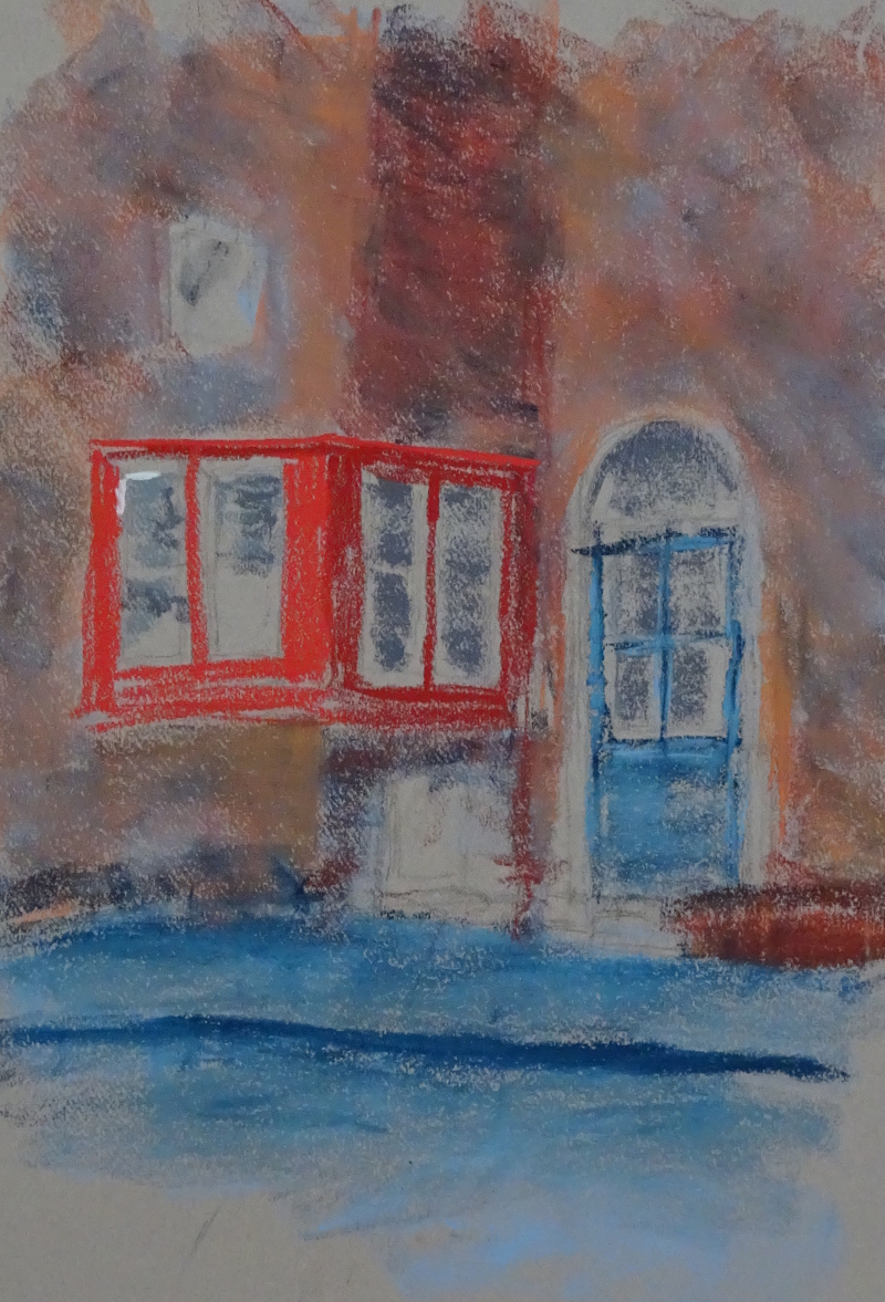 This is the first pass. I looked for all the colours I could see in the brickwork then, using the side of the pastel lightly overlaid them so that they blurred and melded. You can use bright, intense colours this way as long as you don’t overdo it and use all the “tooth” in the paper (Canson Moonstone). then I darked in return of the wall , using a darker red for the window, while my brightest red stood for the brighter part. The pavement and road are too bright. I think that you can more easily tone things down that brighten them so I’m fairly sanguine about that. It took about quarter of an hour to get this far – I do like pastel!
I don’t think this “photo” does justice to the actual work having watched you doing it and seen the result appear like magic. What you produced is so effective and is actually much more attractive and interesting than the original photo!! I do see the point of pastel – it was the first work I did with you and I had a wonderful time with the sky in a few minutes.
I don’t think I’ve ever managed to create a “finished” piece in pastel, but I’ve created some useful and enlightening sketches – and they’ve been great fun.